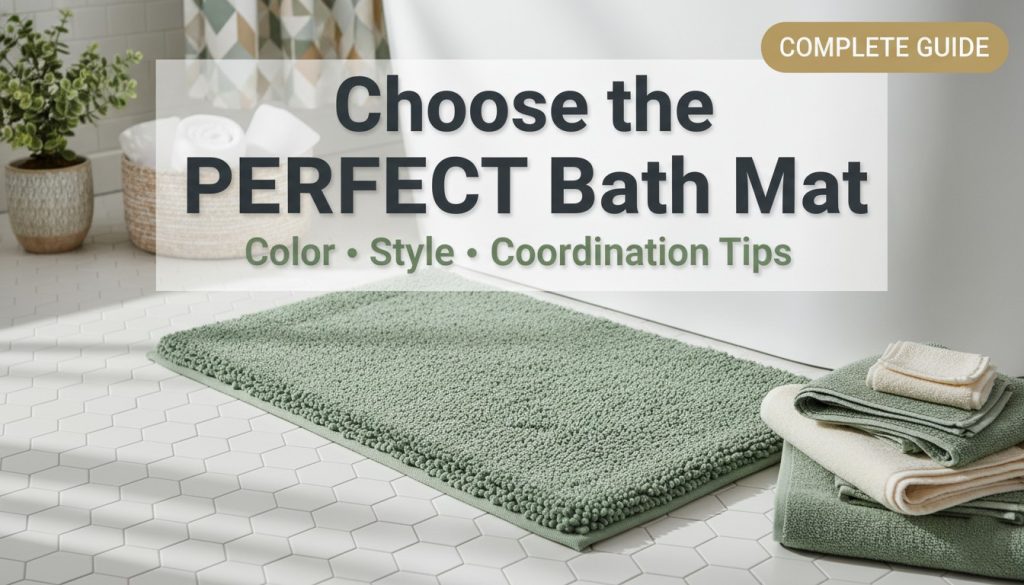
I’ll be honest—I used to think bath mats were just those boring, functional things you grabbed without much thought. You know, something to keep your feet from slipping after a shower. But after living in five different apartments over the past decade and experimenting with everything from bargain-bin basics to splurge-worthy statement pieces, I’ve learned that the right bath mat can genuinely transform your entire bathroom experience.
Let me walk you through everything I’ve picked up along the way about choosing a bath mat that works beautifully for your space.
Understanding Modern Bath Mat Style Trends
The bathroom textile world has gotten surprisingly exciting lately. I remember when my only options were basic white or maybe a sad beige, but today’s market is bursting with possibilities that actually make me excited about this often-overlooked accessory.
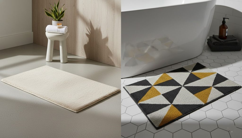
Right now, I’m seeing three major movements that really resonate with how people are styling their bathrooms. The minimalist aesthetic continues to dominate—think clean lines, neutral palettes, and mats that practically disappear into your floor while still doing their job. I tried this approach in my last bathroom renovation, opting for a simple oatmeal-colored mat, and the serene feeling it created was incredible. It made my tiny bathroom feel twice as large.
On the flip side, there’s been this wonderful surge in bold geometric patterns and maximalist designs. My best friend just installed a vibrant Moroccan-inspired mat in her powder room, and it’s become an actual conversation starter. Who knew a bath mat could do that?
What really excites me is the sustainability movement in bath textiles. I recently switched to an organic cotton mat from a company that uses low-impact dyes, and beyond feeling good about the environmental choice, the quality is noticeably superior. These eco-friendly options are no longer the scratchy, hemp-looking things from ten years ago—they’re legitimately luxurious.
The vintage-inspired and heavily textured options have also made a comeback. I inherited a tufted bath mat from my grandmother that I initially thought would be too old-fashioned, but paired with modern fixtures, it adds this unexpected charm that guests always comment on.
Here’s my advice if you’re worried about choosing something too trendy: go classic with your base choice, then add trend-forward elements through easily changeable accessories. Your bath mat can be one of those trend pieces since replacing it doesn’t require a contractor or a massive investment. I typically refresh mine every 18 months anyway, so I’m not afraid to try something current.
Exploring Bath Mat Color Choices for Every Bathroom
Color selection might sound straightforward, but I’ve made enough mistakes here to write a cautionary tale. The powder blue mat that looked perfect in the store? Turned my warm-toned bathroom into a confusing mess. The lesson I learned is that bath mat color choices genuinely matter more than you’d think.
Let me break down what’s worked in different spaces I’ve designed or lived in.
Classic whites and creams have been my safe haven multiple times. In my first apartment with terrible lighting and dated pink tile, a plush cream mat was the hero that made everything feel cleaner and more intentional. White absorbs less light, which helps smaller or darker bathrooms feel more open. The downside? They show every speck of dirt, and if you have hard water like I do, they can develop that dingy yellowish tinge over time. I learned to buy white mats knowing I’d replace them more frequently, or I’d invest in ones I could bleach safely.
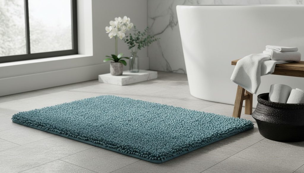
Spa-inspired blues and greens have become my personal favorites. There’s actual psychology behind this—these colors genuinely promote relaxation. I installed a seafoam green mat in my current bathroom, and I swear my morning routine feels calmer. These shades work beautifully if you’re going for that hotel-spa vibe. They’re also forgiving with stains, which is practical if you’re not constantly doing laundry.
When I was feeling bold, I went with a deep burgundy mat in a rental with stark white everything. That jewel tone choice completely changed the room’s energy—it felt expensive and deliberate rather than builder-grade boring. Rich emeralds, sapphires, and ruby tones add drama without requiring you to paint or make permanent changes. This approach works especially well if your bathroom is otherwise neutral.
Earth tones—your taupes, terracottas, warm grays, and sandy beiges—have saved me in bathrooms where nothing else seemed to work. These colors have this magical ability to coordinate with almost anything. My current guest bathroom has tan walls (not my choice, came with the house), and a terracotta mat pulled the whole space together when nothing else could.
The practical stuff I’ve learned about selecting colors: natural lighting changes everything. That gray mat that looked perfect in the afternoon store lighting turned straight-up purple in my north-facing bathroom’s light. I now take paint swatches or fabric samples home and look at them throughout the day before committing.
Size matters too for color impact. Darker colors can make a small bathroom feel cozier (good) or more cramped (bad)—it depends on your overall design. Lighter colors expand space visually, which is why I default to them in tiny bathrooms.
For high-traffic family bathrooms, I’ve learned to embrace medium tones. That pristine white mat I loved in the guest bath would’ve been destroyed in a week in the kids’ bathroom. Meanwhile, darker colors work great there but felt too heavy for the rarely-used powder room where I wanted something fresh and inviting.
Mastering Bath Mat Coordination with Your Bathroom Elements
This is where I really geek out, because bath mat coordination is like the finishing touch that either pulls everything together or announces that you’ve never considered design coherence. I’ve done it both ways, and let me tell you, the difference is striking.
Coordinating with Towels
I used to match everything exactly—same color towels and mat, like a hotel. It looked fine but also kind of boring and predictable. Then I discovered the magic of complementary approaches that create visual interest while maintaining cohesion.
One method I love is tone-on-tone layering. In my current bathroom, I have charcoal gray towels with a lighter dove gray mat. They’re clearly in the same family but create subtle depth that makes the space feel more designed. This approach is forgiving too—if you can’t find an exact match (which happens constantly), going lighter or darker in the same color family almost always works.
The textural contrast method is another winner I stumbled upon. I paired smooth, flat-weave Turkish towels with a high-pile shaggy mat, and the mix of textures made both elements look more expensive. Sometimes it’s not about color matching at all—it’s about creating tactile variety.
Here’s a pro tip from my trial and error: if your towels are patterned or colorful, go solid with your mat, and vice versa. I learned this the hard way with a striped mat and floral towels that created visual chaos. One statement piece at a time in this category.
Coordinating with Shower Curtains
The shower curtain relationship is trickier because it’s such a large visual element. My general rule: if your curtain is busy, your mat should be a supporting player, not competing for attention.
In my previous bathroom, I had a gorgeous botanical print curtain with multiple colors. Instead of trying to match one of those colors exactly, I pulled the background shade—a warm cream—for my mat. This created harmony without the matchy-matchy feel that can look amateur.
When I’ve had solid curtains, that’s when I let the mat shine. My current setup has a simple white curtain, which gave me permission to use that burgundy mat I mentioned earlier. The mat became the focal point it deserved to be.
The biggest mistake I see (and have made) is thinking you need to match metallics between your curtain grommets and mat… anything. You don’t. I’ve mixed brushed nickel curtain hardware with a mat that has zero metallic elements, and it works fine because they’re in different planes of vision.
Coordinating with Overall Bathroom Décor
This is the fun part where everything comes together. I think of bath mat coordination as the final note in your bathroom’s color story—it should echo what you’ve already established elsewhere.
In my most successful bathroom design, I had sage green walls, brass fixtures, and white subway tile. I chose a mat in a muted olive green that picked up the wall color but was different enough to distinguish it from the larger surface. Then I brought in hand towels with both the sage and olive tones. This created what designers call a “layered palette,” and it made my basic bathroom look professionally styled.
The rule of three has been my secret weapon. I limit my bathroom to three main colors maximum—usually two neutrals and one accent. My current scheme is white (tile and tub), warm gray (mat and larger towels), and a pop of coral (in hand towels and a small plant pot). That’s it. More than that, and in my experience, things start looking cluttered.
Here’s what doesn’t work: ignoring your permanent fixtures. I once bought a beautiful cool-toned gray mat for a bathroom with warm brass fixtures and beige tile. It looked wrong every single day until I gave up and donated it. Your mat needs to work with what you can’t easily change—your tile, tub, and fixture finishes.
Selecting Decorative Bath Mats That Make a Statement
I never thought I’d call a bath mat “decorative” until I discovered that this category genuinely exists and includes pieces that are borderline works of art.
My introduction to decorative bath mats came when I was furnishing a rental property and wanted something that looked high-end without spending a fortune on permanent changes. I found a hand-tufted mat with a subtle raised pattern that created shadows and dimension. When prospective tenants walked through, multiple people commented on the bathroom specifically. That mat did the heavy lifting.
Hand-tufted designs with dimensional details have become my weakness. I’m currently using one with a low-pile background and high-pile geometric shapes on top. It feels amazing underfoot—like getting a subtle foot massage—and it looks intentional and designed rather than just functional. The texture catches light differently throughout the day, which sounds silly but genuinely keeps the space interesting.
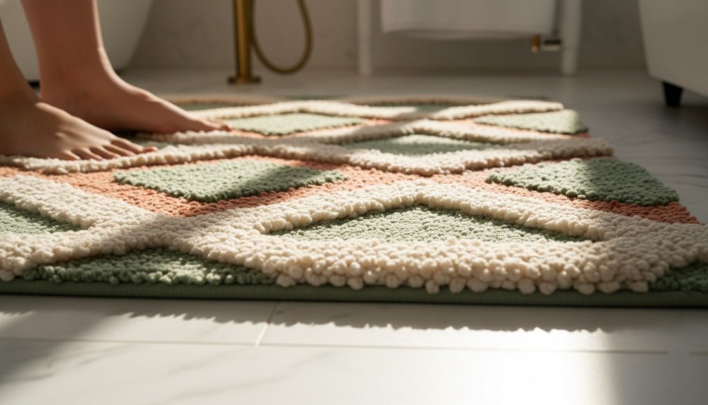
Patterned options deserve their own discussion because I’ve learned they’re not all created equal. Chevron patterns can make a narrow bathroom feel wider (the lines create horizontal movement), while vertical patterns can make low ceilings feel higher. Moroccan-inspired designs bring this warm, collected vibe that works beautifully in eclectic spaces. Botanical patterns feel fresh and spa-like—I used one in a windowless bathroom to bring in a nature element that was otherwise missing.
The practical balance here is real. I bought a gorgeous pure white decorative mat with an intricate raised pattern for my guest bathroom. It’s stunning, but the raised areas trap moisture and take longer to dry, and those white fibers show every bit of dirt. I learned to save the fancy decorative options for low-traffic areas and go more practical in daily-use spaces.
Textured weaves and mixed materials are having a moment. I tried a jute-cotton blend that brought this organic, spa-like quality to my bathroom. The natural fiber texture felt substantial and expensive, and the cotton blend meant it was still soft and absorbent. Pure jute would be too scratchy, but the mixed material hit the sweet spot.
Personalized and monogrammed pieces are something I used to think were over-the-top, but they make excellent sense in specific situations. I gave monogrammed mats as housewarming gifts twice, and both recipients told me they loved having that custom touch. In a guest bathroom, it shows thoughtfulness. In a primary bathroom, it’s a small luxury that makes your space feel more like a boutique hotel.
My advice on the splurge-versus-save decision: splurge on decorative mats for spaces guests see or where you want to create an experience (primary bathroom, powder room). Save in kids’ bathrooms, laundry room bathrooms, or anywhere that’s purely functional. I spent $70 on my guest bathroom mat and $15 on the kids’ bathroom mat, and both were exactly the right choice for their contexts.
Practical Considerations Beyond Aesthetics
Let’s get into the stuff that matters for daily living, because I’ve learned that a beautiful mat that doesn’t perform is just a frustration waiting to happen.
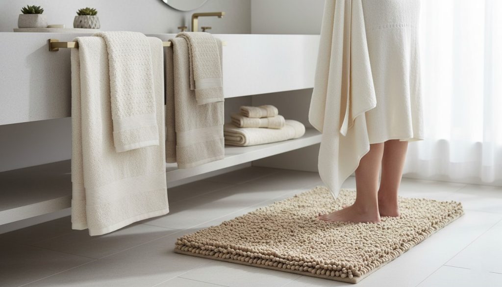
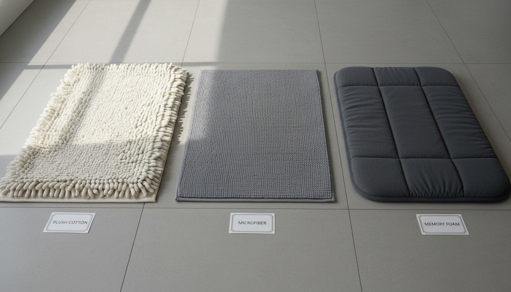
Material selection has been my biggest learning curve. Cotton is my default for most situations—it’s absorbent, soft, washable, and comes in every price point. I’ve used basic cotton mats that lasted two years with weekly washing and premium Egyptian cotton ones that still look new after a year. The difference is noticeable but whether it’s worth the 3x price depends on your budget and how much you care.
Microfiber changed my mind about synthetic materials. I was skeptical until I tried one, and holy absorbency—these things soak up water like nothing else. They also dry incredibly fast, which matters in humid climates or bathrooms without great ventilation. I have one in my windowless bathroom, and it’s never developed that mildewy smell that cotton sometimes gets. The downside is they can feel slightly less luxurious under your feet, though newer versions are getting softer.
Memory foam mats feel amazing but come with caveats I learned the hard way. Standing on one is like stepping on a cloud, which is beautiful for your morning routine. But they typically have a water-resistant top layer rather than being absorbent, so you’re standing on a wet surface rather than a drying one. I use mine in front of the sink rather than the shower for this reason. Also, you can’t throw them in the washing machine—it’s spot-clean only, which is a pain if you have kids or pets.
Bamboo mats are my latest experiment, and I’m impressed by their antimicrobial properties. They’re naturally resistant to mold and bacteria, which is huge in bathrooms. The wooden bamboo slat style doesn’t work for me (too hard underfoot), but the bamboo fiber mats are soft and have this silky quality. They’re also surprisingly durable—mine still looks brand new after six months of daily use.
Size and placement seems obvious until you get it wrong. I bought a standard 20×30 inch mat for a double-sink vanity area, and it looked ridiculously small. Scale matters enormously. For shower exits, I prefer something in the 24×36 inch range so there’s plenty of room to step onto dry mat rather than cold tile. In front of vanities, I go wider—sometimes using runner-style mats that extend the length of the counter.
The placement I’ve found works best is about 6-8 inches from the shower or tub edge—close enough to step onto immediately but far enough that it’s not constantly getting soaked by splashing water. Too close, and it never dries properly. Too far, and you’re dripping across the floor first.
Safety features aren’t exciting but they’re critical. Non-slip backing is absolutely non-negotiable for me after I nearly ate it on a mat without proper grip. Most mats come with latex or rubber backing, but I learned to check because some don’t. The backing should cover at least 70% of the mat’s underside for real security. Some of mine have started losing their grip after a year of washing, which is when I replace them even if they otherwise look fine—I’m not risking a fall.
Care and maintenance varies wildly by material, and I’ve learned to factor this into my purchase decision. I wash my cotton mats weekly in hot water with regular detergent—simple and effective. They come out fresh every time. Microfiber mats should not be washed with fabric softener (it reduces absorbency) or dried on high heat, which took me one ruined mat to learn. Memory foam and bamboo require more delicate care that honestly annoys me when I’m busy.
Between washes, I shake my mats out daily and hang them to air out. This simple habit has dramatically extended their lifespan and kept them smelling fresh. In humid climates, I sometimes rotate between two mats, using one while the other fully dries.
Replacement timing is something I track now after living with gross, past-their-prime mats for too long in my early twenties. If the mat smells even after washing, if the colors look faded or dingy, if the backing is deteriorating, or if it’s been more than two years—it’s time. I used to feel wasteful replacing them, but a $20-40 mat that makes your bathroom feel fresh is worth it. I now see bath mats as consumables like toothbrushes, not permanent fixtures.
Putting It All Together: Three Complete Bathroom Styling Scenarios
Let me walk you through three actual bathrooms I’ve styled to show how all these principles come together in real life.
Scenario 1: Modern Spa Retreat (My Current Primary Bathroom)
I wanted this space to feel like a luxury hotel spa where I could actually relax. I started with what I couldn’t change: white subway tile and chrome fixtures. From there, I built a calming palette.
For the mat, I chose a thick, high-pile microfiber option in seafoam green. This color choice was strategic—blue-green tones promote relaxation while still feeling clean and fresh. The high pile makes stepping out of the shower feel indulgent, and the microfiber means it dries quickly despite our humid climate.
My towels are a shade darker—a eucalyptus green that’s clearly in the same family but provides subtle depth. I mixed in one white hand towel to echo the tile and keep things from feeling too matchy. The shower curtain is a simple white waffle weave that adds texture without competing visually.
I brought in natural wood through a teak bath caddy and a small wooden stool, which warms up all the cool tones and adds that spa element. A single plant on the windowsill completed the nature-inspired vibe.
The whole scheme cost under $200 to implement (excluding the caddy I already owned), and multiple guests have asked if I hired a designer. The secret was just careful coordination and sticking to my three-color rule: white, seafoam, and darker eucalyptus green.
Scenario 2: Coastal-Inspired Guest Bathroom
This bathroom had dated blue tile that I couldn’t change in a rental. Instead of fighting it, I leaned into a coastal theme that made the blue feel intentional.
I selected a sandy beige mat with a subtle texture—almost like linen. This neutral choice complemented the blue without matching it exactly, creating a beach-sand-and-ocean effect. The beige was also practical for a guest space—forgiving with stains and unlikely to offend any taste.
The towels are crisp white, which feels hotel-fresh and appropriate for guests. I added one navy hand towel to bridge between the tile and towels. The shower curtain has a subtle wave pattern in navy and white that ties everything together without being too literal or kitschy.
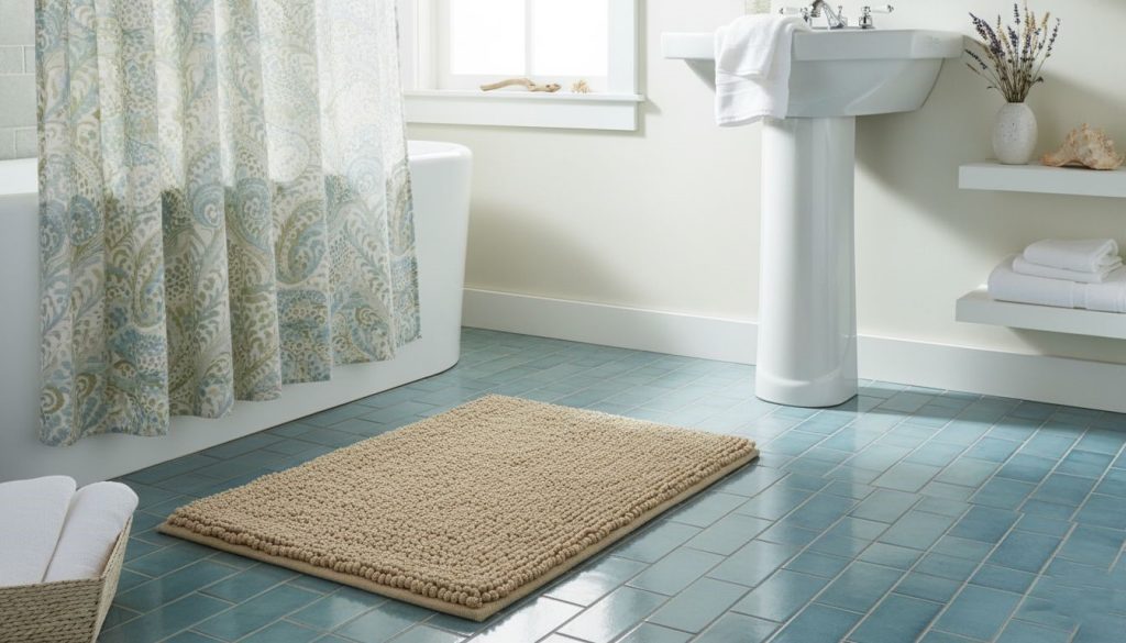
I brought in brass fixtures through a soap dispenser and toothbrush holder, which added warmth and prevented the blue-and-white scheme from feeling too cold. A rope-wrapped mirror and a small glass jar with shells completed the coastal feeling without going overboard.
This bathroom gets tons of compliments despite the ugly tile, proving that thoughtful coordination can overcome existing challenges. The mat was key—that sandy beige choice made everything click.
Scenario 3: Bold Eclectic Primary Bathroom
This was my experimental space where I wanted personality and energy rather than serenity. I had a blank slate: white walls, white tile, basic chrome fixtures.
I started with the statement piece—a richly patterned mat with a geometric design in coral, navy, and gold on a cream background. This decorative mat was my inspiration point for the entire room.
Instead of matching these colors exactly, I played with the palette. Towels are a deep navy that pulls from the mat but in a solid that balances the pattern. I added coral hand towels that echo the mat’s accent color. The shower curtain is cream with gold geometric lines—coordinating with the mat’s pattern style but not identical, which would’ve been overwhelming.
I brought in plants with coral-colored pots, a gold-framed mirror, and navy accessories. The eclectic vibe comes from mixing modern geometric patterns with traditional brass fixtures and organic plant elements.
This space feels collected and interesting rather than decorated all at once, which was the goal. The trick was letting that bold mat be the hero and having everything else support it rather than compete. If I’d added more patterns or colors, it would’ve tipped into chaos.
Making Your Choice
After years of living with various bath mats in different spaces, here’s what I’ve learned matters most: your mat should serve both form and function in proportions appropriate to your space and life.
In guest bathrooms and primary suites where you’re creating an experience, weight aesthetics more heavily. These are the spaces where decorative bath mats and carefully coordinated color choices make the biggest impact. Go ahead and splurge a little here—it’s where you’ll notice and appreciate it.
In family bathrooms, kids’ spaces, and high-traffic areas, function comes first. Absorbency, durability, washability, and appropriate color choices that hide stains matter more than making a design statement. That doesn’t mean these mats should be ugly, just that they need to work hard without requiring constant maintenance.
Your bath mat is one of the few bathroom elements you can change easily and affordably. Don’t stress about making the “perfect” permanent choice. Try something, live with it, see how it makes you feel. If it’s wrong, you’re out maybe $30 and you’ve learned something about your preferences.
The mat that makes you smile when you step onto it every morning? That’s the perfect one, regardless of trends or rules. I hope sharing my experiences—the successes and the failures—helps you find yours a little faster than I did.
Your bathroom deserves that finishing touch, and you deserve the small daily luxury of a mat that’s just right. Now go forth and create a bathroom that feels like it was designed intentionally, because with the right mat choice, it will be.
Leave a Reply